The Best Responsive WordPress Themes for 2014
Nowadays larger and larger parts of the Internet audience is using mobile devices to browse. With the advancement of tablets and mobile phones, people prefer to keep all of the interesting information in their pockets, rather than on their computers. This is why you need to be sure that your website displays equally well both on computers and mobile devices. Here are the best responsive WordPress themes you can get this year.
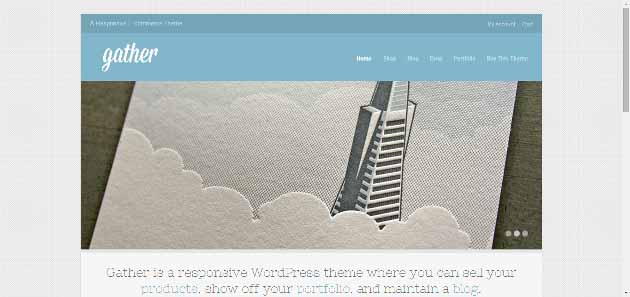
Gather
Gather is a great responsive theme, which will serve you great for your blog. It has a very cool slider, and comes with WooCommerce integrated. There are even portfolio layouts for this theme.
Lucid
Lucid is an amazing theme by Elegant Themes. If you’re running a magazine-style blog and you can’t find a theme that will display equally as well on all devices – you’ve just found one. It has a strict grid structure and its design is clean and minimalist – concentrate on the content, not the effects.

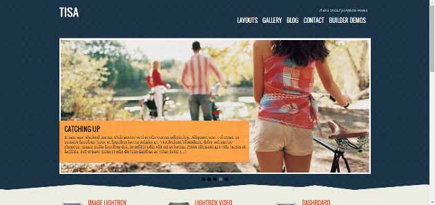
Tisa
Tisa is a great multi-purpose responsive theme. You can use it for a blog, portfolio, or even as a static website. The theme includes cool gallery slideshows, and advanced theme options for great customization.
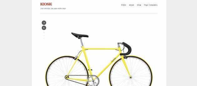
Kiosk
Kiosk is perhaps one of the simplest themes that there could be. Although it has a very obvious minimalist design, you will be surprised to see how functional this theme could be: it is WooCommerce ready, included image sliders, header image uploading, many different color schemes, and of course – responsiveness.
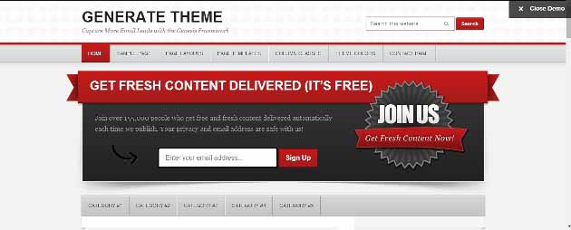
Generate
Generate is a professional blogging theme, with a very responsive mobile design. The Genesis Framework will help you get the most out of your blog, as it focuses on building your email list. The theme has 6 different layouts which display excellent on all devices.
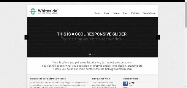
Whiteside
Whiteside is a business WordPress theme, with a beautiful responsive layout. Whiteside has a homepage feature slider, which is fully responsive – shows just as good on any screen size. The theme has several shortcodes and portfolio layouts, for your business.
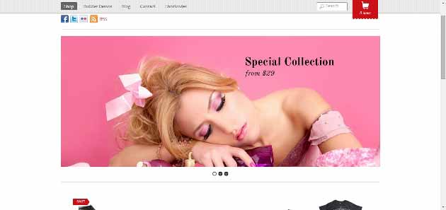
Minishop
Minishop is a responsive eCommerce WordPress theme. The theme serves best as a fashion shop, which has lots of shortcodes, an Ajax (no need to reload the page to add/remove items from cart!) shopping cart, and a great featured slider.
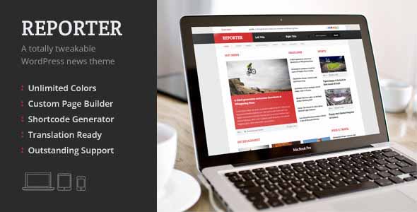
Report
Report is a magazine-style news or blog theme. It has a fully responsive and really sleek design. On the top of the header, there is a sliding text bar, for your most recent news. The site has really great functionality options, to give you the freedom to easily show the news to the world as they are.
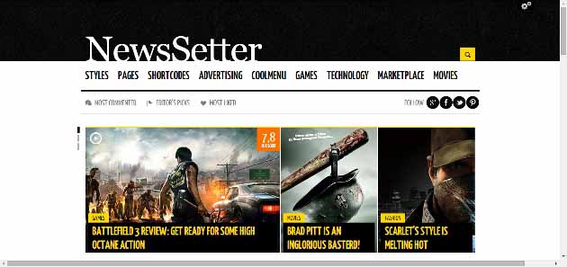
NewsSetter
This is the perfect magazine-style tech/movie blog theme. It has an amazing multi-item front page slider, advanced drop-down menus, and easy social media integration. NewsSetter comes with over 30 different shortcodes for you to make your site even more attractive.
Being able to show great blog design both on desktop and mobile devices has become very crucial in our days. With a great deal of the platform market going to mobile, you need to make that change too – get a responsive WordPress theme and make sure that you never lose a visitor.
-
 Ten Beautiful Travel Related WordPress Themes Travel bloggers have a special kind of relationship with their readers. A good
 -
 Our 6 Best WordPress WooCommerce Themes for 2014 The powerful WooCommerce plugin helps transform ordinary display websites into fully-functional online shops
 -
 The Best Business WordPress Themes for 2014 Having a business doesn’t necessarily mean that you have to spend thousands on
